
From Domain to Idioms: A Critique of Failure Factories
Introduction
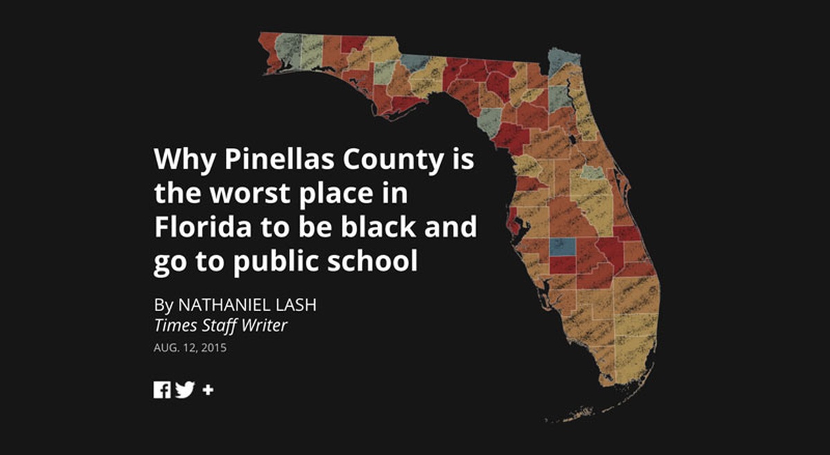
Data journalism is a data-driven approach to communicating stories and presenting news for mass media consumption. The award-winning story, Failure Factories, adopted this approach to showcase the increasing resegregation of Pinellas County public schools to the public at the broadest reach possible. The decision to publish the story through a scroll-based format, paired with its easy accessibility using mobile platforms, reflects the writers’ aim to engage more readers in the ongoing crisis in Pinellas County.
Data and Task Abstractions
The task and data abstractions set the precedence for the chosen idioms by the designers in creating an engaging story. Public school resegregation can be abstracted to a present-trends action target pair that highlights the increase and decrease of black students at several public schools in the county. The locate-extremes task abstracts the goal of the author to identify the schools (i.e., location unknown) with extreme characteristics of the high percentage of black student enrollees (i.e., target known). The authors use the output of the previous task to identify correlations between poor academic performance and the percentage of black students.
The multidimensional table dataset from the Department of Education has all schools in the state of Florida and the school year as the keys that index the items with attributes such as county, academic performance, and number of enrollees per race of students. Academic performance and the number of enrollees per race are quantitative data, but the former is sequential while the latter is diverging. Academic performance pertains to the percentage of black students failing in math or reading, which can have a minimum or maximum value typical to sequential attributes. On the other hand, the percentage of black students does not follow a typical diverging scale meeting at a common zero point. However, the data semantics of “resegregation” provide a meaningful midpoint for the attribute, which justifies its classification as diverging. Meanwhile, the school year gives time-varying semantics to the dataset that supports the task of finding trends, and the county attribute serves as the base data to derive the geometry of Florida counties.
Visualization Idioms
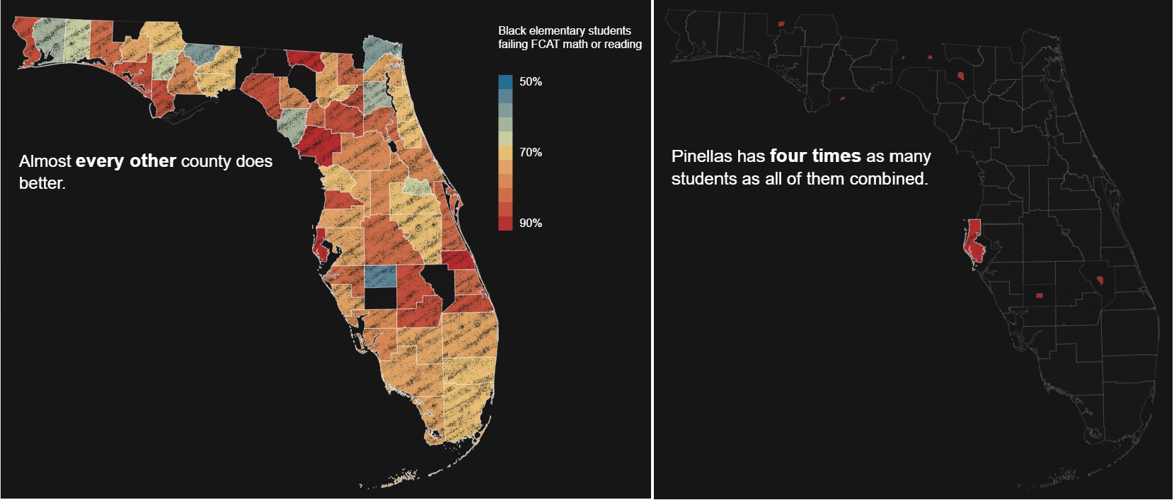
A geographic map encodes geometric data with area marks containing size and shape. In Failure Factories, the choropleth map uses color channels to give an overview of the educational standing of black students per county in Florida. It can be contested that the designers should have used a sequential colormap, as identified in the data abstraction, with fewer bins for better discriminability of which counties are doing better or poorly concerning Pinellas County. The designers then used non-contiguous cartograms to highlight substantial size disparities derived from the population of black students between the worst-performing counties. The authors appropriately minimize the distortion by using only size channels to show the magnitude instead of size and shape channels from typical cartograms.
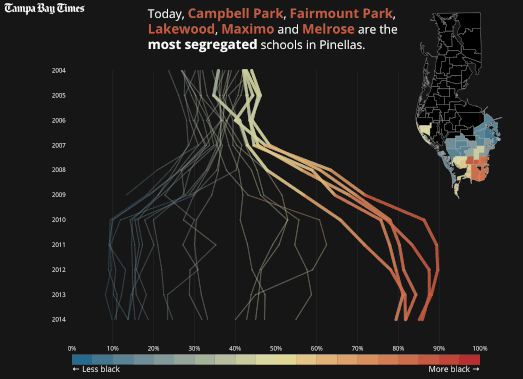
The scroll-based transitions used on the parallel coordinates emphasize the change in the segregation of schools over time rather than letting the readers track the line marks on their own. The designers used spatial position, color, and linewidth channels to redundantly encode and provide visual popout to the most important attribute, resegregation. The perception of change in Pinellas County schools is even accentuated with the line marks moving together in nine stages, maintaining the same context. In the final stage, scroll-based transition was used to bridge the same dataset into the context of academic performance. The careful use of animated transitions between two dataset configurations enhances the readers’ understanding by decreasing the cognitive burden of tracking multiple marks.
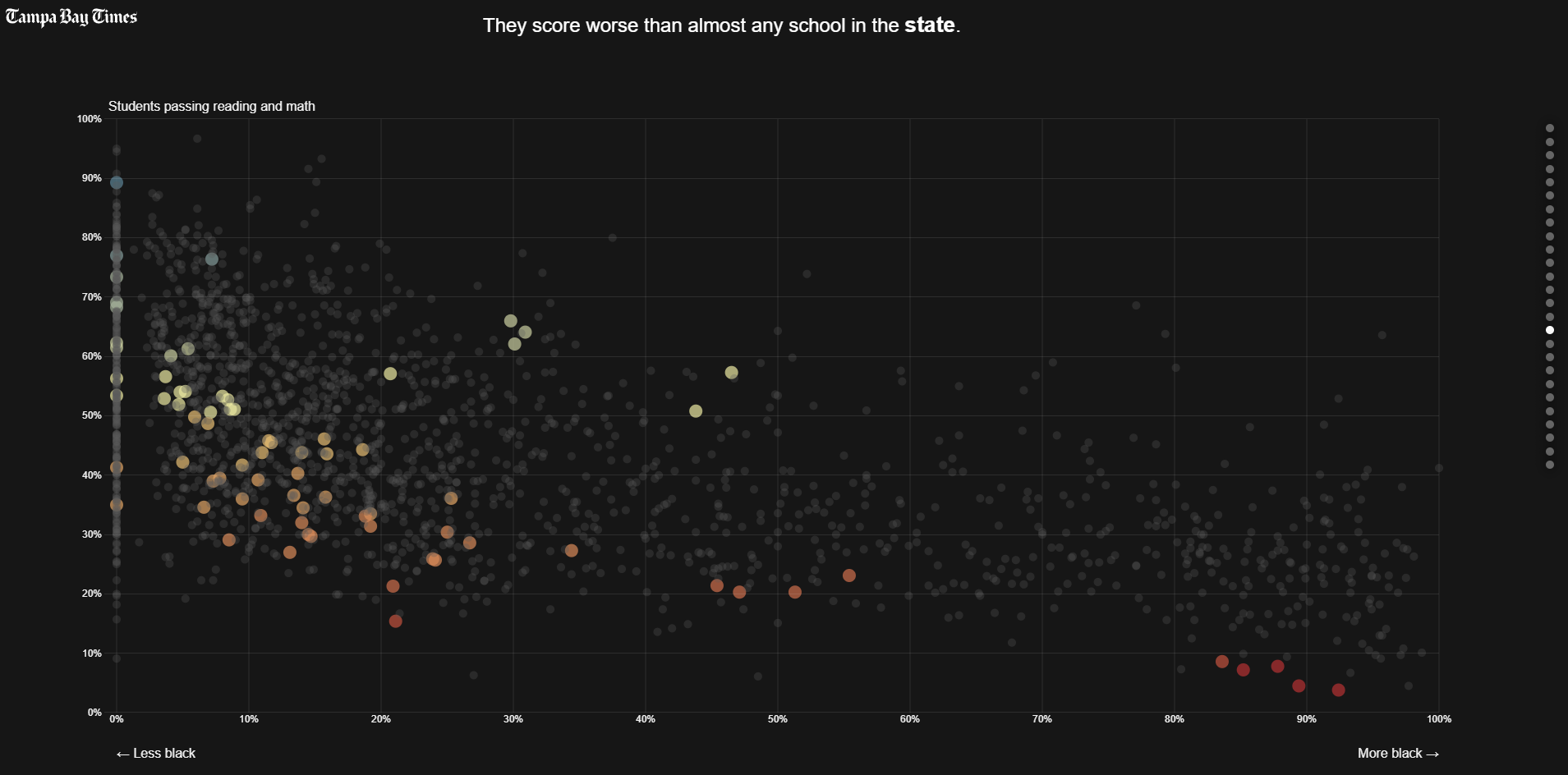
The scatterplot shows the correlation between academic performance and resegregation. It shows the dire situation of Pinellas County black students using the transparency channel to superimpose the dataset with the entire Florida school. Color has been used to encode resegregation redundantly on the point marks, and the motion channel was effectively employed to temporarily highlight binary classifications, such as private and public schools, during data filtering.
Using scroll-based storytelling in dynamic idioms guides the audience to the complex structure of the dataset by providing multiple viewpoints and context. Failure Factories sets an example of presenting data from a high-level overview and drilling down into the details by taking advantage of interactivity to present the stories relating to public issues with an investigative and data-driven approach.
References:
[1] Lash, N., & Playford, A. (2015, September 15). How We Made “Failure Factories.” Source. https://source.opennews.org/articles/how-we-made-failure-factories/
[2] Munzner, T. (2014). Visualization Analysis & Design. CRC Press.
[3] Bostock, M. (2012, May 16). Object Constancy. https://bost.ocks.org/mike/constancy/